
Stewberry Flower Farm
Two acres of intention in the Okanagan.
Stewberry is not a flower shop. It is a field you are invited into — grown slowly, cut by hand, and handed over still warm from the sun.
Every stem is grown here, on two acres in Summerland — never sprayed, never flown in, never rushed.
Standing in a field of something beautiful. Unhurried, generous, a little sun-worn.
Okanagan neighbours, brides, florists and hosts who would rather know the grower's name.
Warm. Rooted. Alive.
A wordmark, a stamp, and two small signatures.
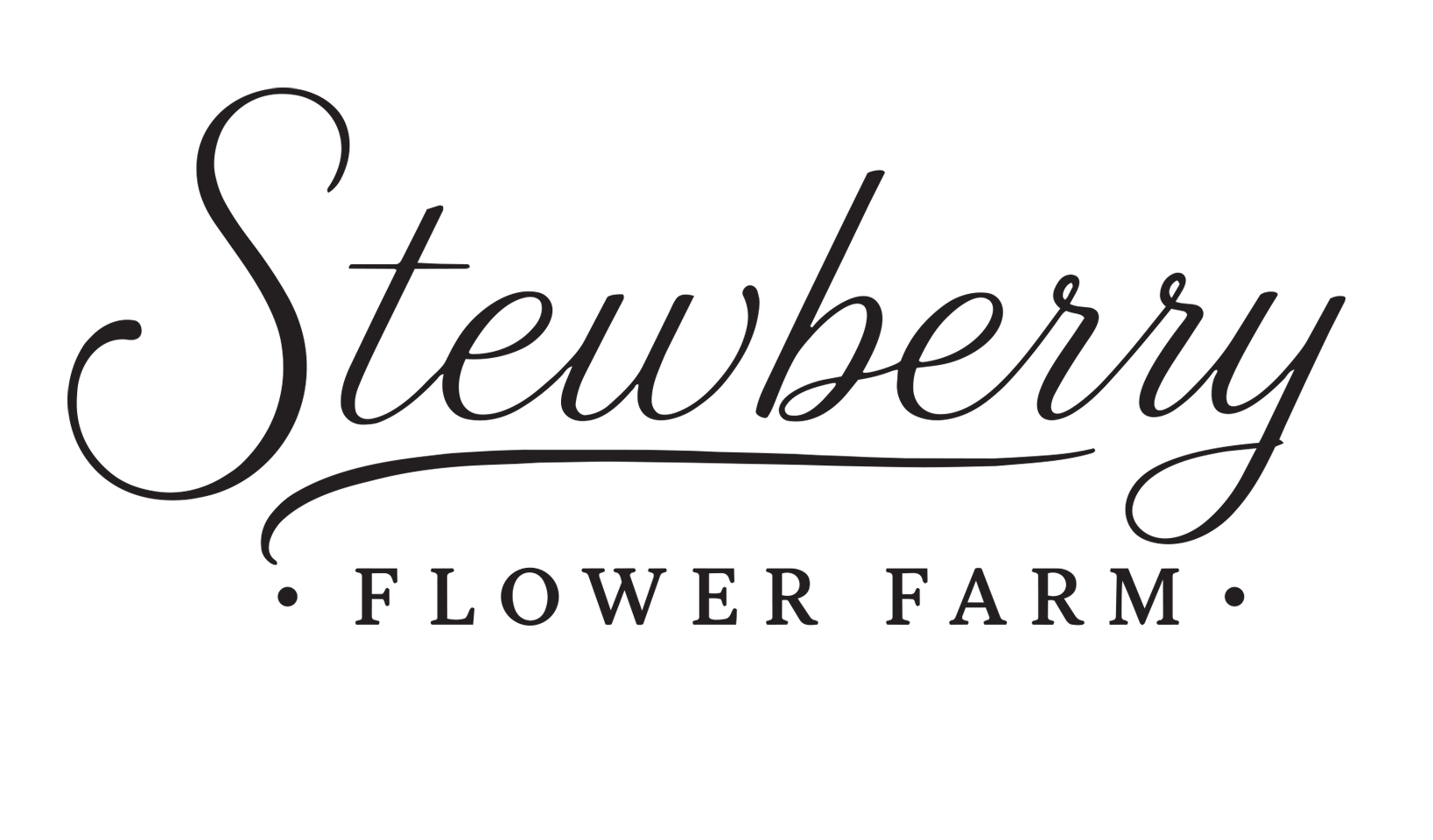
The lead mark for signage, website headers and anywhere the name needs to be read first.
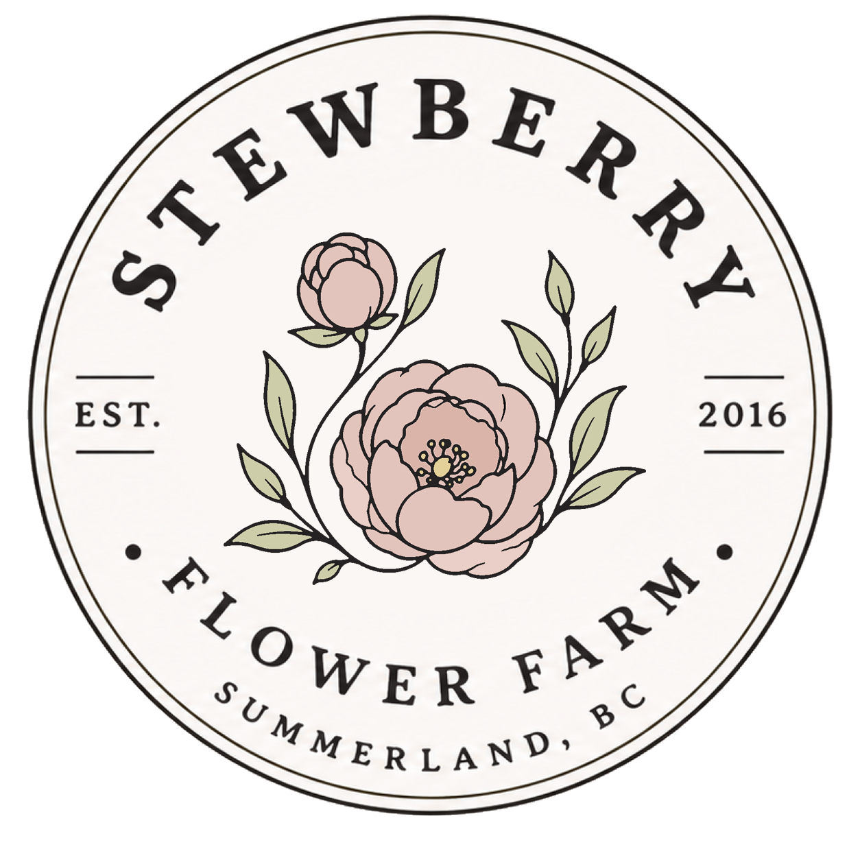
The seal. Use on wax, tags, packaging and the back of a card — anywhere the brand should feel hand-pressed.

Favicon, profile photo, stickers. The smallest the brand can go.

A quieter seal for invoices, footers and printed collateral in one colour.
Keep a margin equal to the height of the letter S on all four sides. Nothing enters it — no type, no photo edge, no fold.
Place marks on Ink, Cream or a calm area of photography.
Use one mark per surface. The stamp and wordmark rarely need each other.
Recolour, outline, add shadows, or stretch either mark.
Set the stamp over a busy bloom or crowd it against a trim edge.
Field colours, not brand colours.
Ink and Cream carry almost everything. Sage is the working accent. Gold, Blush and Lavender are seasonal — a few square inches at a time, never a background.
Ink on Cream is the default pairing for every piece of type. It reads warm rather than black.
Sage carries buttons, labels and rules. Never set long body copy in it.
Gold, Blush, Lavender and Clay are for hairlines, a single word, a wax seal. Two accents per surface, maximum.
Lora speaks. Jost labels.
abcdefghijklmnopqrstuvwxyz
1234567890
Where every stem tells a story.
Headlines, pull quotes and prices. Italic is the brand's voice — use it for anything that sounds like Renee talking.
abcdefghijklmnopqrstuvwxyz
1234567890
Summerland, BC · Est. 2016
Body copy, buttons and every small capital label. Wide tracking on uppercase — 0.2em and above, always.
Write the way she'd say it at the farm gate.
Short sentences. Plain nouns. No exclamation marks, no florist clichés, no urgency tactics. Warmth does the selling.
Say what is in season, and what isn't.
First person. "I grow", "we cut", "come by".
Let sentences breathe. Nothing shouts.
Name the place. Summerland, the Okanagan, the two acres.
Daylight, hands, and a lot of empty space.
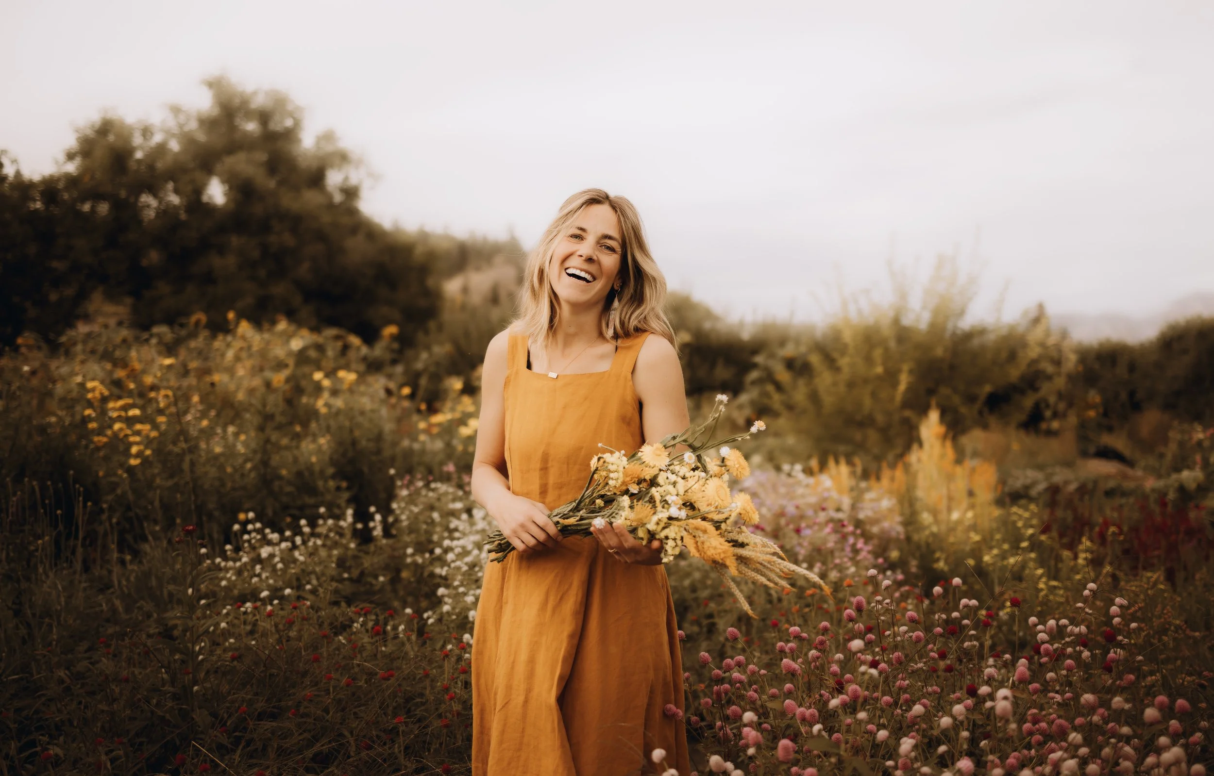
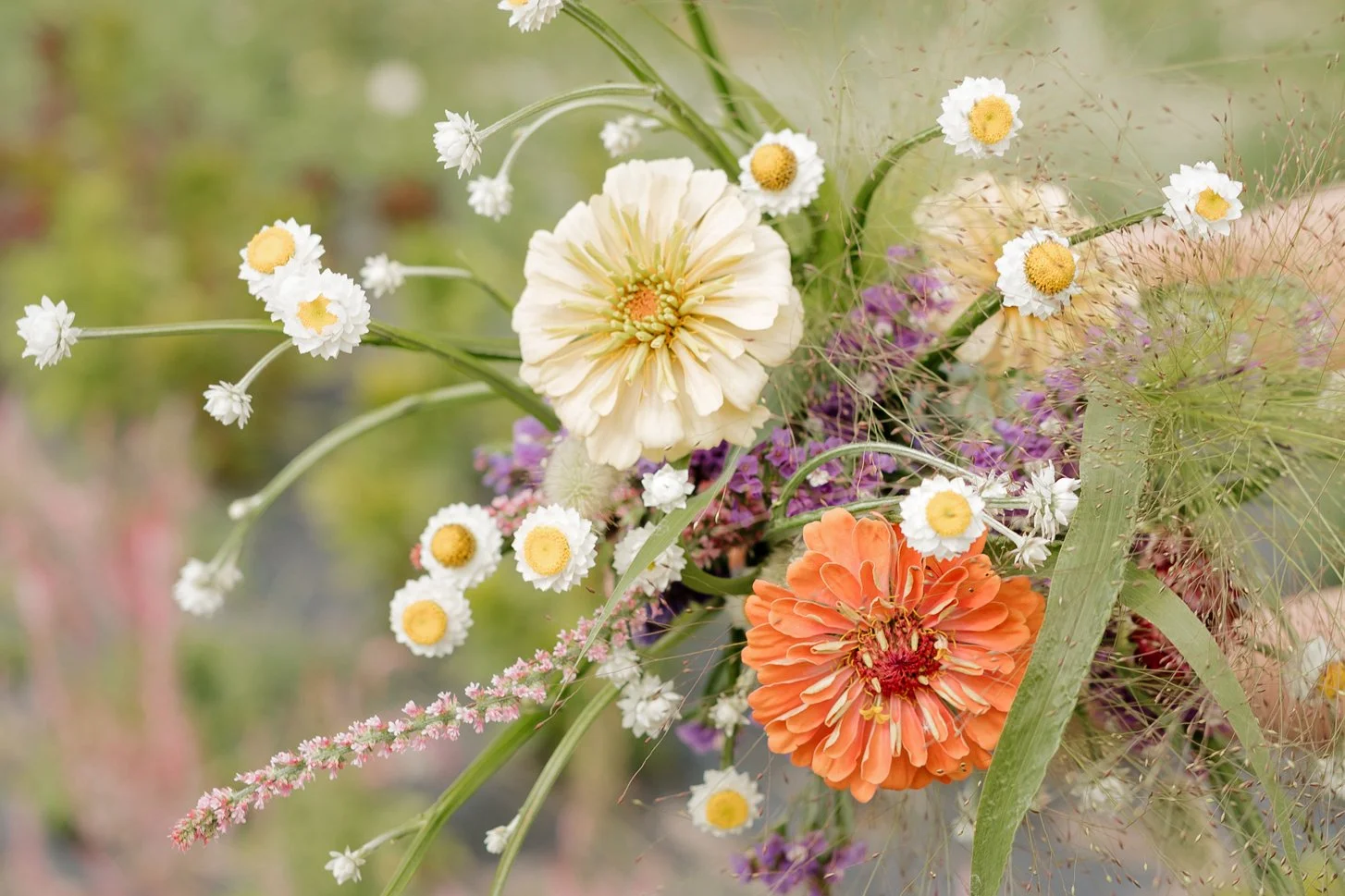
Natural, early or late. Soft shadows, no flash, no heavy grading — warm the shot, don't stylise it.
Hands in the work, buckets, rows, one imperfect stem. People before product.
Leave a quiet corner for type. Hairline rules and 1px inset borders frame a page; nothing else does.
With the system set, the business cards are just a small, well-made piece of it.
Say the word and I'll take this palette, the stamp and the Lora italic into three or four card directions — front and back, print-ready.